


Drawing it out. Another fiscal system, plus mouse chromosomes, and a chicken with a human face.
Another short blog on another fiscal system drawing, and a family habit.

Drawings help!

My desk is littered with doodles and scrappy drawings, from idle time fillers1 to some more serious attempts to draw out relative simplicity from narrative complexity.
Long suffering collaborators are used to me holding up post-it scribbles to my laptop camera to try and explain something. Oh how I miss a real whiteboard… and also IRL people around it.
Here is one sketch that keeps paying - I use it to try and help disappointed development agency people understand why their failing project is not their fault.
Their posting and/or project were just at the wrong moment for that place’s episodic growth cycle. It draws on Pritchett et al (2016) and the lines on my own forehead.
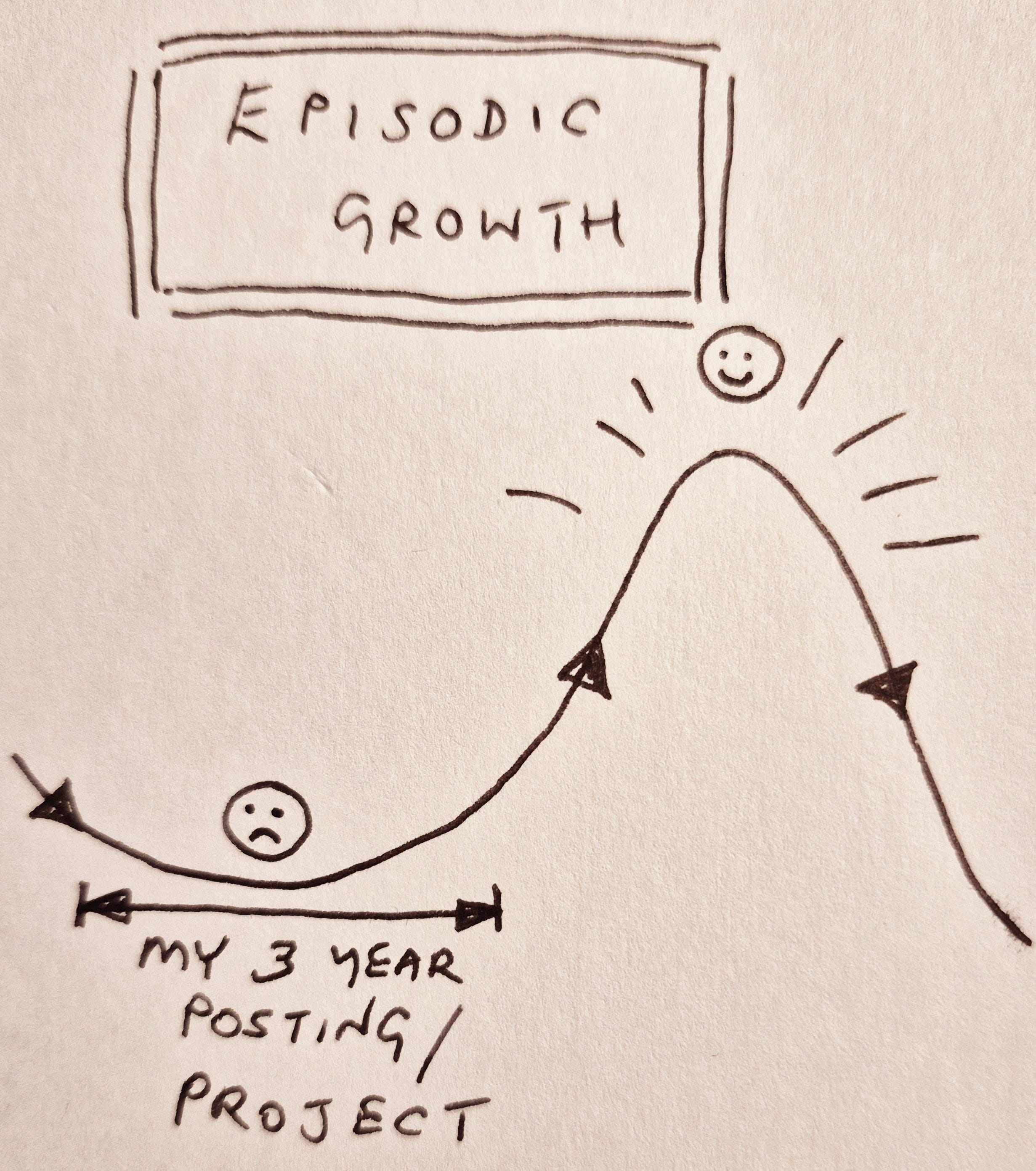
When I add waves for election cycles in that place, and also for their own home country (if they work for a government agency), it gets even more hopeless… (a blog coming about this shortly).
Last week I shared a ‘fiscal fan fiction’ drawing of Ken Opalo’s Kenya crisis Blogs - and got some warm responses and interest (not least from Prof Opalo himself!)2.

Lurking in the text
My scribbles that seem to have some merit may get turned into graphics by my ‘in house’ artist hamsiiidris, though the house style is wilfully ‘punky’. Some like this, others do not.
One defence of our style over more corporate graphics is the (readable!) size of our labels!
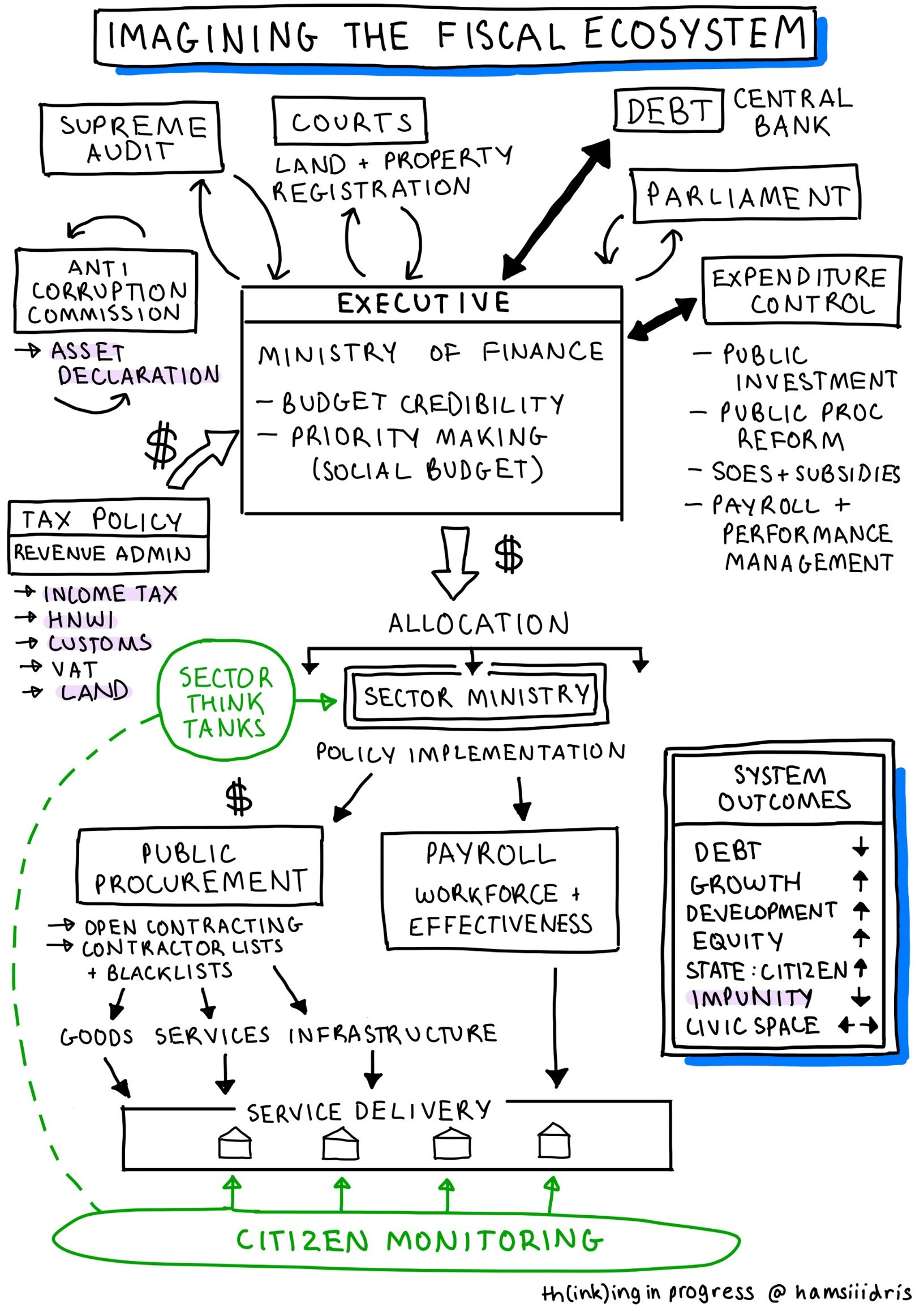
Our aim is usually to draw out (in a picture) something that I think is lurking in the text - often non linear information, relationships, systems.
An ongoing frustration in my governance/political economy work is that we (humans generally, governance people in particular) try and engage with intensely complex system problems (Sri Lanka’s political and economic crisis; Ukraine’s war-and-reform challenges etc) by setting these out as items in a long list or dense textual report. We may then say sagely ‘don’t treat this as a linear list or a tick box exercise’ but we all do exactly that - run through it, ticking things off.
In these examples (Sri Lanka, Kenya, Ukraine) I see complexity that operates as a system - and therefore needs to be engaged with in a dynamic way, with attention to equilibria and sub-systems, unintended consequences, and creating the conditions for desired outcomes to emerge. Not lining up ducks or ticking off items on a list.
But my starting point is ‘messy events’, and institutional and political relationships, not the theory or tools of how to represent an abstract system. This makes the pictures messy as they are usually drawn at pace.
Another fiscal system picture…
Before the Kenya system diagram there was rough one for Sri Lanka:
This was a very rapid attempt to capture some key parts of the Sri Lankan economic and political crisis - based on the IMF Governance Diagnostic and the Civil Society Governance Diagnostic Report (both very impressive pieces of work although disappointing on gender equality, despite it being macro critical and all that…).
I also tried to make it a general model - that could be adapted for other countries.
A systems approach to impunity
My motivation in drawing this out was to think systemically about how political impunity operates, and where one might focus attention to try and reduce it. The pale purple shading in the diagram is a first attempt at this, along with other system outcomes (see list in box on right). I see this as a tool to run a finger over to help discussion and strategy making, not a definitive representation.
The alternative to this ‘systems approach to impunity’ is the orthodox behaviour of external partners such as bilateral donors - to choose a single component ‘organisation’ in a hierarchical system and think ‘we can be the project partner’. I dislike this approach (having done it myself) as I think it ignores system effects and complexity. It is also a kind of thin ‘donor coordination’ (make a list and tick off projects - ‘we’ll do asset declaration and you do income tax’) often at the expense of more strategic and systemic engagement.
Donor coordination should not look like the spreadsheet for a bring a dish lunch.
Bad guys are good at systems thinking - shouldn’t the good guys be good at it too?
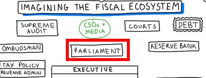
The picture (above) was the first iteration of the Sri Lanka fiscal picture, which attracted some useful and critical feedback - especially because I had side-lined Parliament, which upset some friendly fiscal democrats… in the later iteration Parliament is front and centre, though still not as large as some would like (looking at you Warren Krafchik…. Warren and friends are doing some really exciting work on ‘fiscal ecosystems’, and have some exciting ecosystem graphics in production…).
This is all work in progress. I note that ‘the c word’ (corruption) is not mentioned in this picture. This was not intentional. But the same happened in the Kenya system graphic (reader feedback pointed this out).

Each piece of work I do tends to foment some new pictures. I hope that this might build up to a new set of tools, but no takers yet.
Postscript: drawing in our genes (well, chromosomes) …?
I thought I was my family’s OG3 ‘Picture this’ guy.
My late Mum was good at drawing and making things (Christmas hats, fancy dress costumes), but did not do it in her work.
My late Dad was an able carpenter but terrible artist. He taught me a lot about genetics by scratching out diagrams on the foil covered paper from the inside of cigarette packets, but these had little artistic merit. Then I remembered something that Dad’s colleague - Colin Beechey - had said at Dad’s funeral. Colin gave the ‘science eulogy’, which was both funny and moving. Family and friends were surprised that Dad was also a world renowned geneticist, as well as being someone who could handle an axe and - like a farmer - turned down the tops of his wellington boots.
Colin worked with Dad for decades and at the funeral referred to Dad’s original drawing of what later became the global gold standard ‘ideogram’ for mouse chromosomes.
“We were using Ted's chromosome diagrams and simpler versions of other people’s before the more detailed ones accepted as the 'gold standard' were published by Ted. I did the drawings from your Dad’s measurements from lots of mouse cells using a computer drawing package called 'Freelance'. I have attached a copy of the diagram and also a real karyotype from a cell spread”.
And here it is: my Dad and Colin Beechey’s drawing out simplicity from complexity.
I am biased but think it is truly impressive.
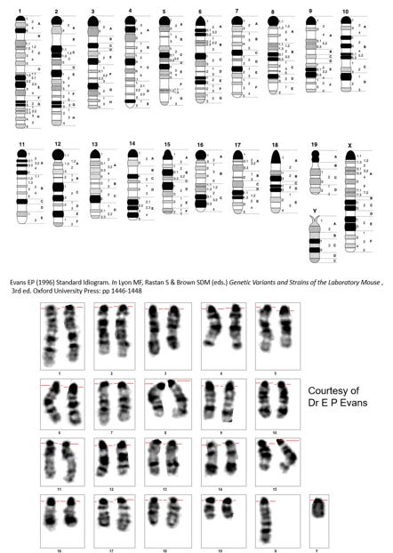
As far as I know, this ideogram are still in use. A truly enduring graphic.
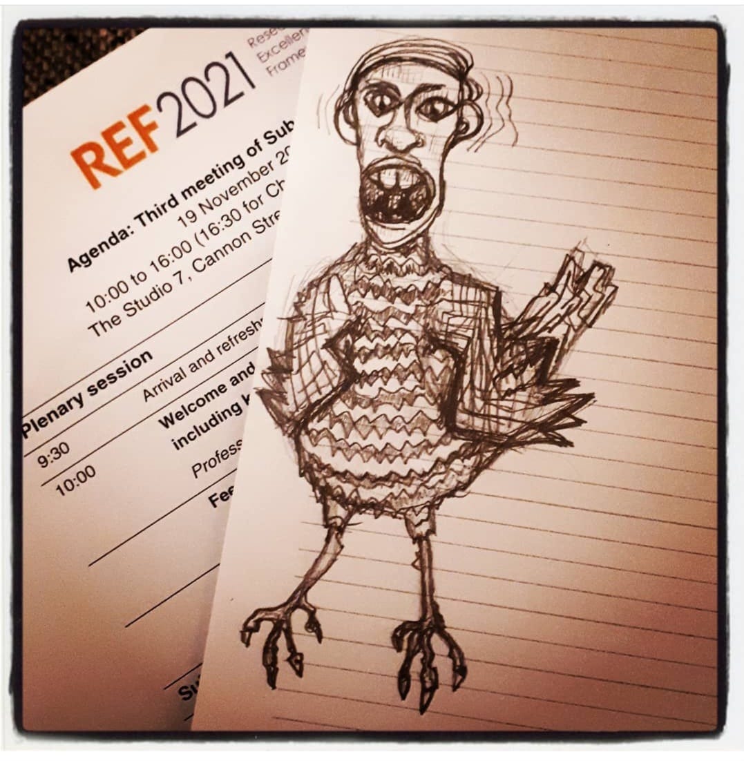
‘Rees-Mogg chicken’. Drawn at the UK’s Research Excellence Framework (REF 2021) kick off meeting.
I am privileged but recommend this ‘fangirl/boy’ approach to sharing ideas while praising work that you love - my book review blog of Stefan Dercon’s Gambling on Development in late 2023 (also my first ever substack) might spur a new initiative - the Practical Politics Platform - in 2025. If you like your political economy plain language, public, and actionable, watch this space.
Should a man in his 50s say OG? Probably not. Best stick to using Pitch Perfect (1, 2 but never 3) as the stock provider of metaphors in most of my professional work.
Found your interpretation of the Kenyan crisis very insightful and also that of Sri Lanka. Just some questions, what is happening in the system? Who are the actors? What are the incentives? Would be interesting to understand the bigger picture around the systems. Am currently working on something similar that’s why am intrigued. Using causal loops looking at the negative effects and positive and trying to understand the patterns, different effects and how different factors ie. Debt, fiscal policies etc are undermining, reinforcing and how different effects impact on the economic system as a whole.